

Hero design
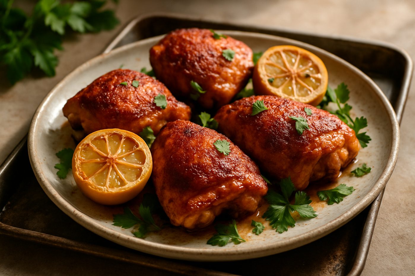
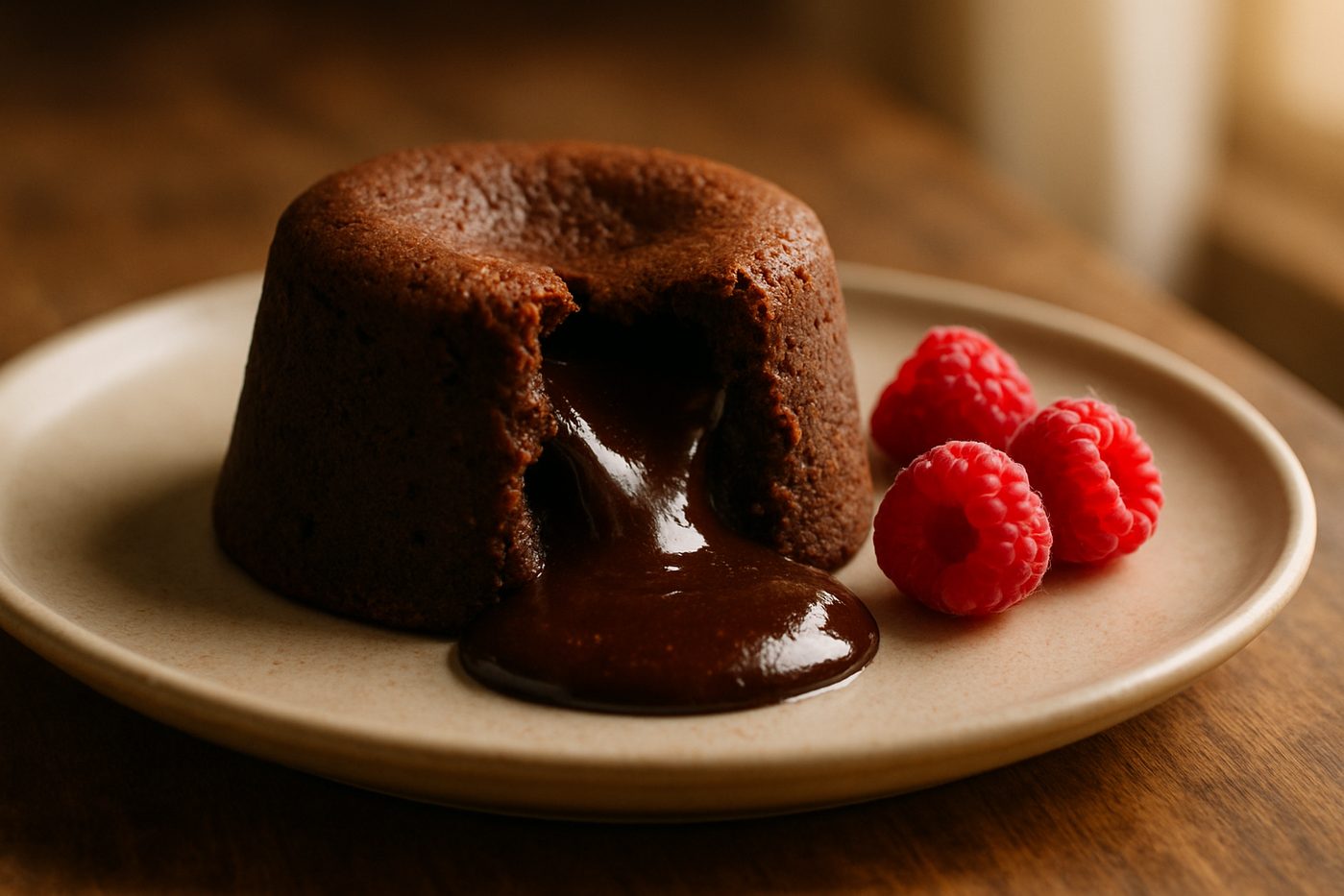
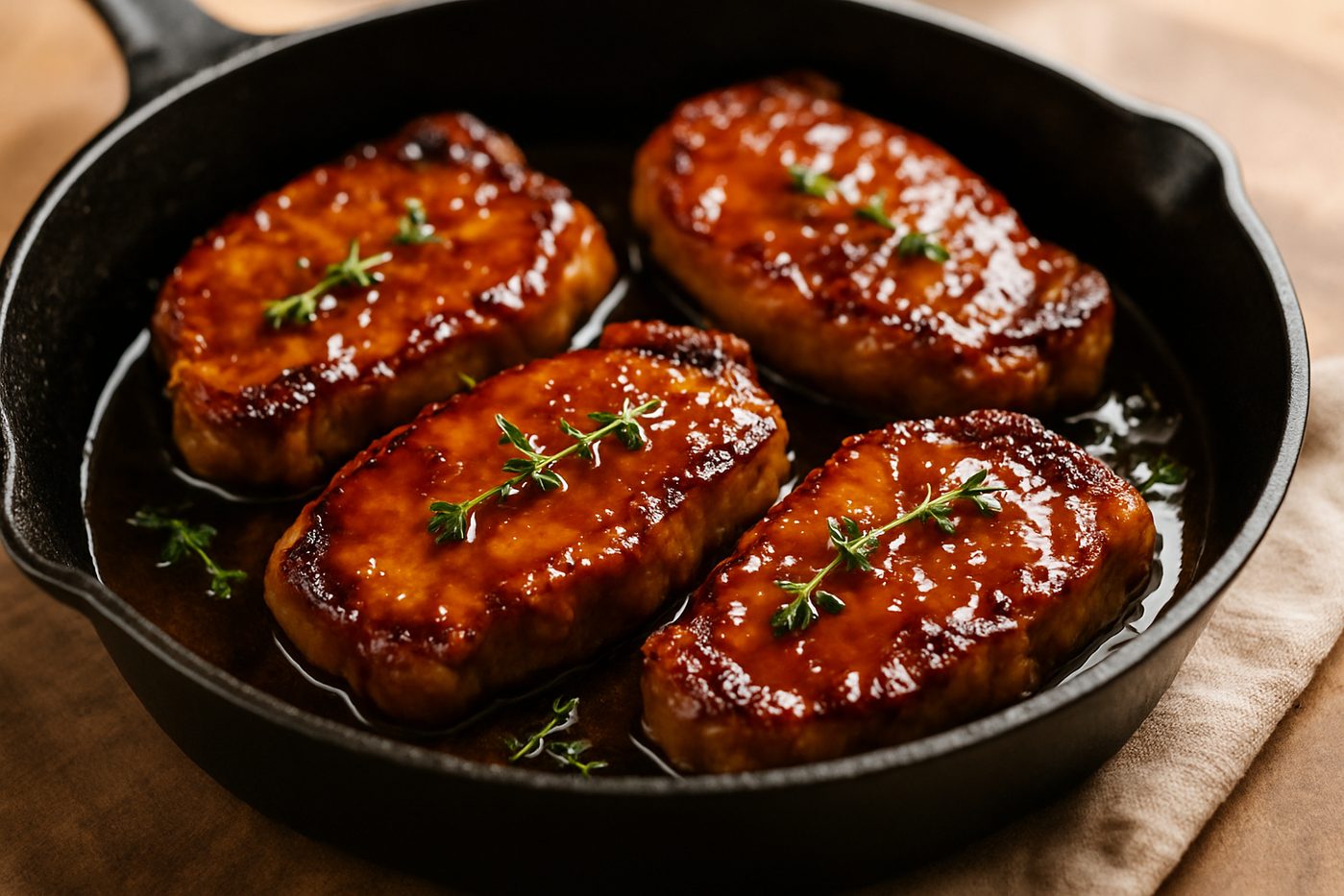
Your recipe photo runs full width, with the title, category and author set over it. Built for brands whose food photos sell the product.
When to use the Hero design
Hero leads with your photo. It fills the top of the card, and the title, category and author sit over it, like a magazine cover. Ratings, times and servings follow, then the ingredients and directions.
A good fit for: brands with strong food photography, launch and seasonal recipes, and any store that wants the recipe page to feel like an editorial feature.
What you get: a full-width photo with the title on it, print and share buttons up top, and the same order on phones, where the photo stays edge to edge.
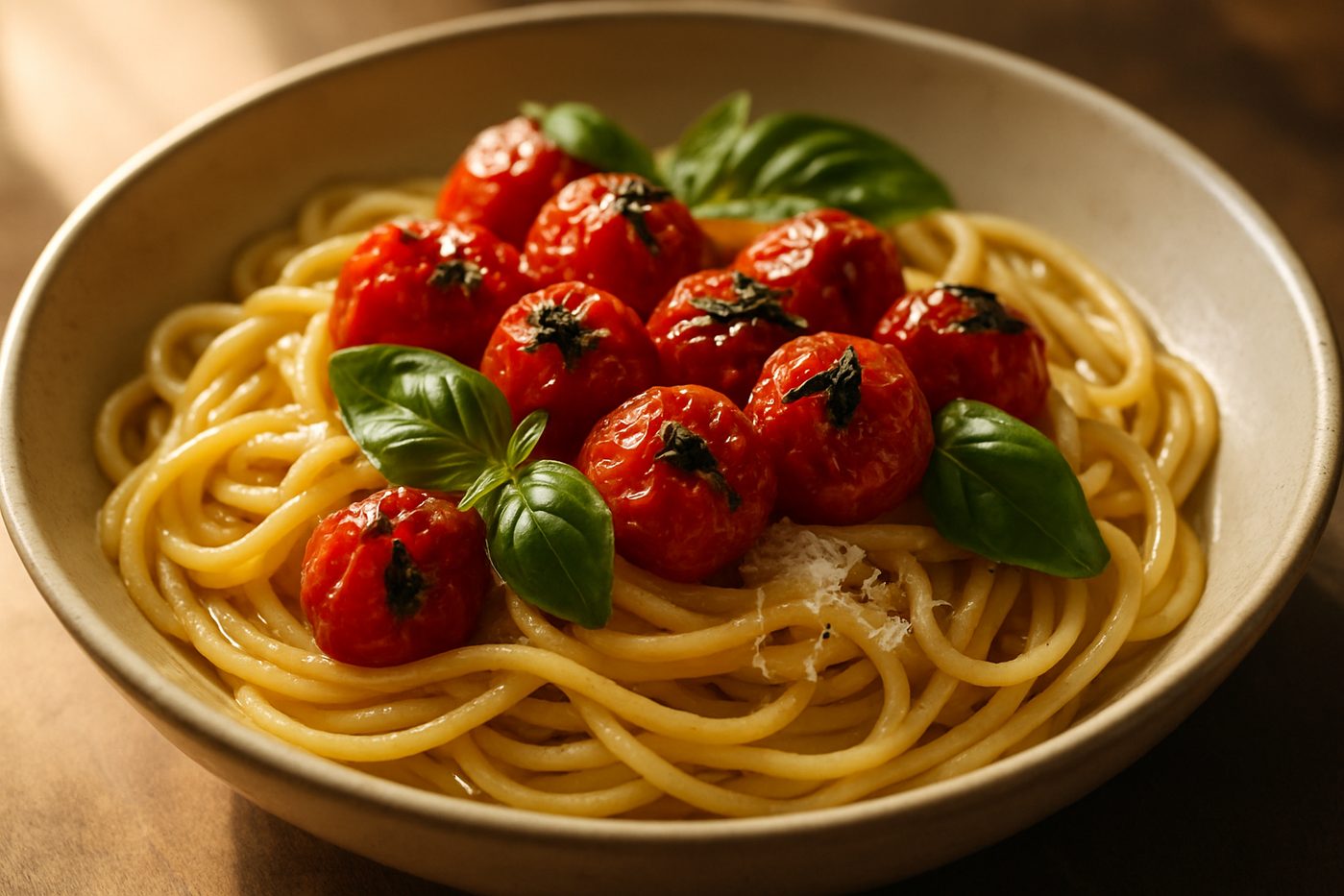
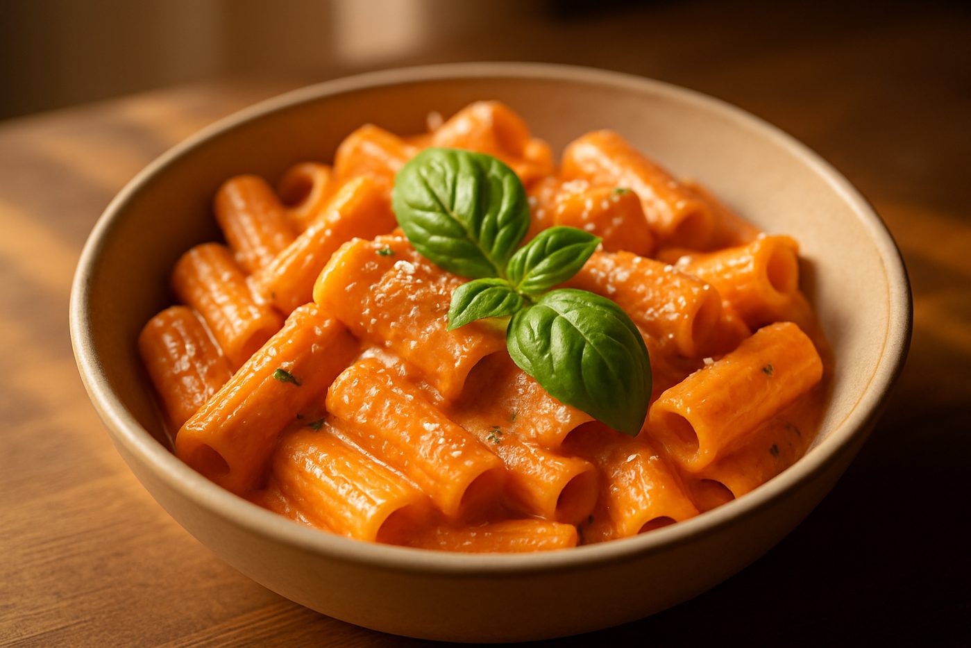
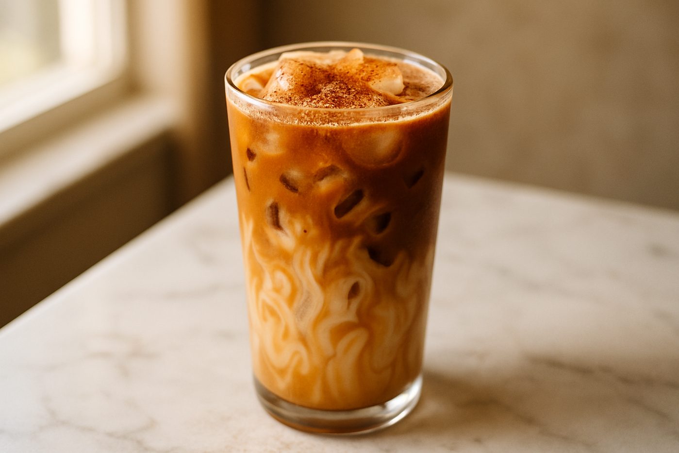
Explore the other designs.
Pick one design for your whole store. Switch any time, on any plan.
Questions about the design.
Common questions about this recipe card design
Can I change the colours in the Hero design?
Yes. Pick one accent colour for buttons, borders and links. The card uses your theme's fonts. For finer changes, add custom CSS in the app.
What image size works best for the Hero design?
The photo runs the full width of the card with the title over its lower part, so use a wide landscape photo at least 1600px across, with calm space near the bottom for the text.
Is the Hero design mobile-friendly?
Yes. On phones the Hero design stacks into one column, and the photo scales to the width of the screen.
Can I use a different design for each recipe?
No. You pick one design for your store, and every recipe uses it. You can switch designs in the app at any time.
Does the Hero design support shoppable ingredients?
Yes, on the Growth plan. Link an ingredient to a product, and an Add to cart button shows beside it. Shoppers check out through your normal Shopify cart. All six designs support this.
Ready to create beautiful recipes?
Start on the free plan, or try a paid plan free for 14 days.